Like a pilot has to know their plane’s altitude, speed, and direction, so do you as a Product Owner need to understand at what pace your product is being built, how widely it is being adopted, how actively it is being used, and how satisfied users are with their experience.
To assist you in defining and measuring them, we’ve compiled a list of what we consider to be the most insightful metrics for Product Owners.
1. Sprint Burndown Chart
At the start of a Sprint, during the Sprint Planning event, the Scrum Team collaboratively creates a plan by discussing the Sprint Goal and selecting the items from the Product Backlog to add to the Sprint Backlog that give them the highest chance of meeting it.
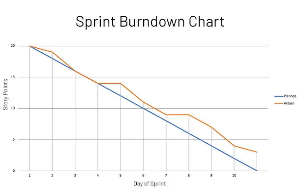
During and after the Sprint, the Sprint Burndown Chart shows the actual completion of work items against the plan. The horizontal axis represents the time, measured in days, and the vertical axis represents the effort, measured in story points.
During the Sprint, the Sprint Burndown Chart can help the team to Inspect & Adapt their plan by continually tracking their likelihood to achieve the Sprint Goal.
In doing so, the Product Owner can choose to make changes to the priority of work items along the way so that the team can meet the plan under changing circumstances.
After the Sprint, the Sprint Burndown Chart is a useful artifact to bring to the Sprint Retrospective, as it visualizes the actual completion of the work compared to the initial plan—and can therefore serve as a conversation starter.
Example Sprint Burndown Table:
| Day | Estimated Effort Left | Estimated Burndown | Actual Effort Left | Actual Burndown |
|---|---|---|---|---|
| Day 1 | 20 | 2 | 20 | 1 |
| Day 2 | 18 | 2 | 19 | 3 |
| Day 3 | 16 | 2 | 16 | 2 |
| Day 4 | 14 | 2 | 14 | 0 |
| Day 5 | 12 | 2 | 14 | 3 |
| Day 6 | 10 | 2 | 11 | 2 |
| Day 7 | 8 | 2 | 9 | 0 |
| Day 8 | 6 | 2 | 9 | 2 |
| Day 9 | 4 | 2 | 7 | 3 |
| Day 10 | 2 | 2 | 4 | 1 |
| Effort Left | 0 | – | 3 | – |
Example Sprint Burndown Chart:
2. Sprint Backlog Completion Ratio
If the Scrum Team planned 10 story points for a Sprint and, for one reason or another, completed 7, then their Sprint Backlog Completion Ratio after the end of the Sprint would be 70 percent.
Generally, you want the Sprint Backlog Completion Ratio to be high. When it is low, it can be a sign of external volatility, unresolved dependencies, or problems with the forecasting and/or planning approach of the Scrum Team.
Changes in the Sprint Backlog Completion Ratio from Sprint to Sprint can be highly revealing. They can surface external or internal problems before most of the Scrum Team’s members have even become aware of them, and therefore help the Scrum Team preventively course-correct.
Example Sprint Backlog Completion Ratio table:
| Sprint # | Story Points Planned | Story Points Completed | Completion Ratio |
|---|---|---|---|
| Sprint 1 | 10 | 7 | 70% |
| Sprint 2 | 16 | 8 | 50% ↓ |
| Sprint 3 | 10 | 10 | 100% ↑ |
3. Velocity
Velocity is the total amount of work, measured in story points, that the Scrum Team completed within a Sprint. Average Velocity is the average amount of work that the Scrum Team completes across Sprints.
During the Sprint Planning event, some Scrum Teams use the Velocity from the previous Sprint to put a limit on the amount of work that can be planned. Others rely on Average Velocity in general or Average Velocity for the Past X Sprints.
Average Velocity is mostly reliable for Scrum Teams in more mature stages of Tuckman’s Forming-Storming-Norming-Performing model, as the Velocity of a new Scrum Team tends to vary significantly from Sprint to Sprint.
Thanks to a statistics phenomenon called reversion to mediocrity, seasoned Scrum Teams with tens of Sprints and years of history can rely on their Average Velocity as a reliable, if imprecise, predictor of performance.
Example Velocity table:
| Sprint # | Story Points Completed | Sprint Velocity | Avg. Velocity |
|---|---|---|---|
| Sprint 1 | 7 | 7 | 7 |
| Sprint 2 | 8 | 8 | 11 ↑ |
| Sprint 3 | 10 | 10 | 8.3 ↓ |
4. Delivery Time
Delivery Time is the average amount of time it takes a work item to move from intake to completion, as measured in minutes, hours, days, weeks, or months. Also known as “Lead Time” in Kanban, the total time it takes to deliver value to the customer.
Delivery Time is essential because it helps Scrum Teams track the total time—across Sprints—it takes a work item to move from being created on the backlog to being released to production. Since it includes all waiting times, it can surface external dependencies and internal inefficiencies.
There are many ways for Product Owners to improve Delivery Time: from prioritizing the elimination of inefficiencies with the Scrum Master and the Developers on the team to working with the Scrum Master and Solution Architect to reduce technological and procedural dependencies to a minimum.
An advanced implementation of Delivery Time breaks that time down into sequenced steps, measuring the time it takes to complete each step and the waiting times between them. Those waiting times can be a highly useful metric for negotiating SLAs/SLOs/SLIs with third parties.
The Product Owner can choose to alleviate the frustration of waiting for their customer by surfacing some of the progress on their order along the way, much like Domino’s Pizza Tracker reveals the steps and the time it takes for a pizza to be delivered to your door.
Example Delivery Time table:
| Quarter | Avg. Feature Delivery Time |
|---|---|
| Quarter 1 | 13 business days |
| Quarter 2 | 15 business days ↓ |
| Quarter 3 | 19 business days ↓ |
| Quarter 4 | 14 business days ↑ |
6. Product Adoption
Adoption metrics measure how much a product is being adopted by its customer and/or user base.
For example, the Product Owner of a Workday implementation for an organization’s employees might measure its adoption across individual departments and teams to identify their most and least active user groups.
The Product Owner of a B2B application might want to measure how their product is being adopted across geographies and customer segments; their B2C counterpart might do so with audience segments based on demographics or interests.
Adoption can be as simple as a consumer installing an application on their iPhone or MacBook, and as complicated as a Fortune 500 company purchasing a piece of enterprise software for their needs.
7. Product Usage
If 100,000 users adopt a product, that doesn’t mean that all of them are actually using it. Usage, then, measures how many customers and/or users are actively using a product (or any given feature of it).
Usage can be measured in many ways.
Many startups measure Active Users, grouping them into Daily Active Users (DAUs), Weekly Active Users (MAUs), and Monthly Active Users (MAUs).
They also track data points tailored to their users’ experience, such as screen views and interactions with UX elements, to determine what keeps their users engaged and what causes them to churn.
There are also industry-specific metrics; a social media platform would be measuring product usage differently from an Internet publisher.
At Get Agile Right, for example, we are interested in Page Views and Average Engagement Time, or the average amount of time our readers spend our articles with the website in the foreground of the browser.
We can then compare these metrics across articles to understand which ones get the most readers—and which ones keep our readers engaged the most.
8. Churn Rate
Churn rate, also known as “Dropout Rate,” is the percentage of customers who stop paying and/or users who stop using a product. Whereas Product Owners want their adoption and usage rates high, they want their churn rates low.
The Churn Rate is one of those metrics that become useful only when tracked over time, as the general trend can be more revealing than the momentary state.
When the Churn Rate is high, or it starts to go up, this is typically a sign that you are acquiring the wrong users, setting misleading expectations, or providing a bad user experience.
An increasing Churn Rate should serve as a cue for the Product Owner to pay attention and try to diagnose the underlying problem that may be causing them. The more drastic the increase, the more pressing the problem.
9. Net Promoter Score (NPS)
Net Promoter Score (NPS) is a methodology for measuring customer satisfaction and predicting business growth.
The NPS methodology uses a simple question, “How likely is it that you would recommend [product] to a friend or colleague?”, to elicit quantitative and qualitative feedback from customers.
The quantitative feedback is a customer rating on the scale of 1 to 10; the qualitative feedback is their freeform explanation why.
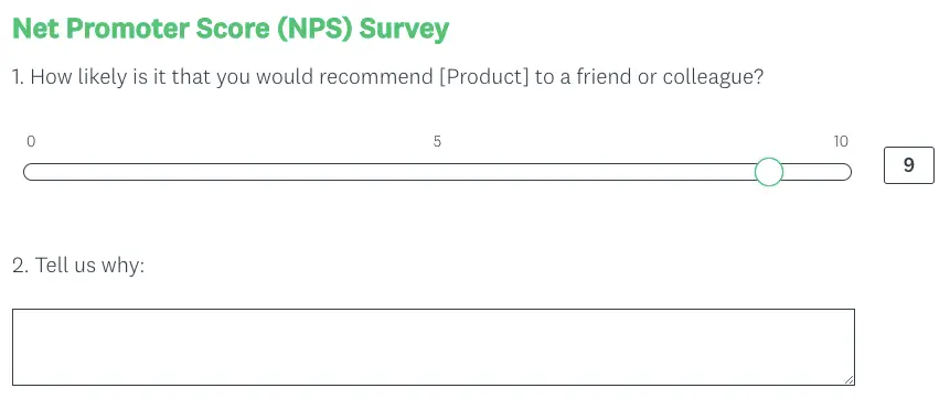
As a result of the NPS survey:
- Customers who rate their experience 9-10, called Promoters, are loyal enthusiasts who will keep buying and referring others;
- Customers who rate their experience 7-8, called Passives, are satisfied but unenthusiastic and may be stolen by competitors;
- Customers who rate their experience 0-6, called Detractors, can damage your product’s reputation and impede your growth.
How many answers are required to deem a Net Promoter Score (NPS) survey statistically significantly depends on the industry and the product at hand.
An owner of an account software with 100 customers might get great value out of 63 replies, while an owner of a mobile app with millions of active users would probably be looking to get tens of thousands of responses.
